Vision Design System
Building a design system is a complicated task.
Merging two together is crazy.
Vision came about from a need for our design team to have standards internally and for our collaboration between developers to be as productive and consistent as possible. We have developed components, following platform standards for iOS, Android and Web, testing and insuring they work on all form factors and platforms. We provide usage guidelines for designers and developers- for each component or pattern.
And most important of all- We have designed and and developed our components to the highest standards of Accessibility. This includes, Voiceover compatibility, color contrast ratios, and large text scalability.
What we wanted to achieve with building Vision?
Improve the UX of our digital products
Promote consistency across our team
Reduce engineering & design efforts
Reduce & reuse
Getting started
How we refactoring components and aligning team and choosing where to start in an ongoing project.
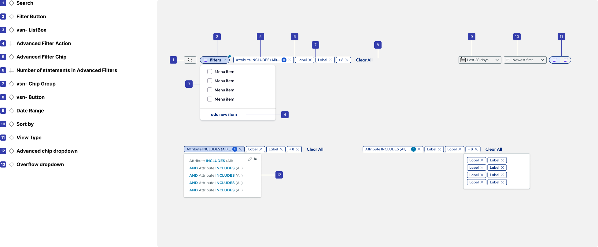
Focused first on most used items like navigation, buttons, chips, etc.
Patterns that were most need of revitalization
What can be built to keep things moving with Dev
Interactive Communication
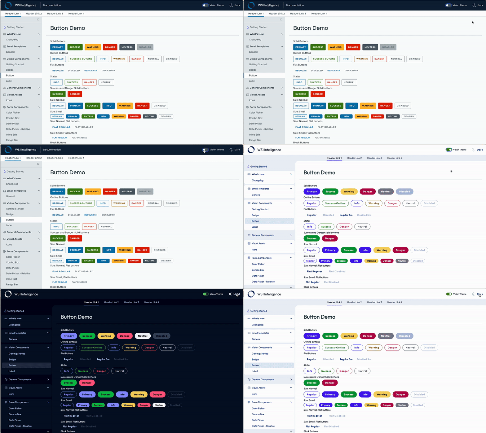
Providing an interactive resource for all components was the first step. As we are crossing over from one brand to another, having the ability to show what is changing is helpful for developers to understand what they will need to update from a code perspective.
Document Everything!
While design if often the fun part for creative teams, documenting how patterns work, their options and limitations is extremely valuable and will answer many of the questions designers have while trying to fit patterns into their design solutions.
Illustrations for delight
All patterns and no play makes for a very drab enterprise scape. Defining an illustration and icon style to go along with functional patterns is key to making the design feel approachable and engaging. It’s also fun!
Color and Text
Ensuring that color is planned out is key to a working system. As you get going you will rely on a color set so much more than anyone realizes.
Color chart defining tonal range and accessibility
Design Tokens & Naming Conventions
Creating a robust design token and naming structure is key to aligning styles across multiple properties and allowing design variants to be quickly applied to adjust assets as needed. When things aren’t named well and you want to rebrand it can cause a alot of rework. We took the time with Vision to rename all tokens to prevent issues in the future.
Wrapping Up!
Being able to affect change on a whole product suite via an efficient design system is hugely rewarding. Knowing that it can be leveraged and improved upon and changes will manifest across lots of properties is amazing. For more info on how this was accomplished send me a message!
Impact & Results
Overall Impact:
6 Admin Consoles
36 Components Refactored
Two Design Systems Libraries
Documentation and Content Guidelines
Omnissa Rebrand
Overall Results:
36 Components Refactored
Dark mode added
Hundreds of illustrations redesigned
Accessibility and User Testing Completed


