Crafting Insights
Designing for data driven insights is hard. Let’s just put it out there.
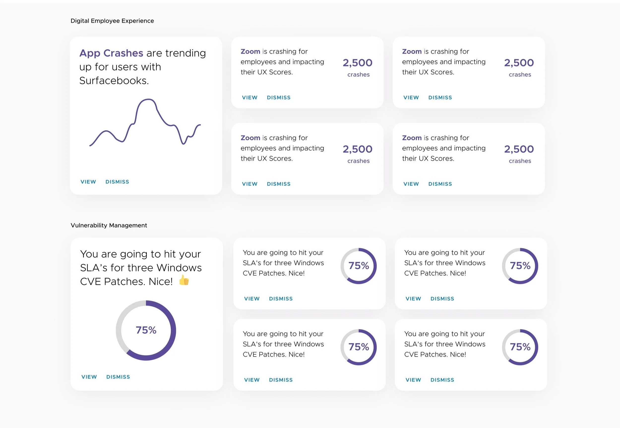
When I first started designing the Workspace ONE Intelligence console a few years ago, I had a concept of an inbox like experience where users didn’t have to go spelunking through a bunch of dashboards to find the most important problem that should command their attention. Basically, if there’s a handful of critical issues they should know about or fix let’s highlight those -and allow them to dive in or pin them so they can come back to them easily.
I’ll admit I was likely inspired by Google’s Inbox (not gmail) which was a very clean, uncluttered experience that has since been sunset, but was a fresh take on email and focused on simplicity and showed simple previews of documents and reminders, some of which has been incorporated into gmail as it stands today.
As is common in the enterprise software world, things don’t always get built right away. This was the case with my insights inbox concept. There were other pressing dashboards that product management felt was important and the machine learning model was going to take time to ramp up. So at first we tried some insight cards that could highlight a few things in a card at the top of some pages with relevant context.
Insight card about Windows Desktop Vulnerability.
Part of the problem with the cards was keeping the number of insights appearing in a small footprint small enough to be usable. We first used them to highlight CVE (common vulnerabilities and exposures) and we quickly ended up with 100+ and no real way to intelligently limit the severity in a meaningful way.
Insights for Anomalies
Finally getting back to the original use case, we worked with the data science team at VMware worked that now had enough data to track anomalies that would would trigger an insight, for example if an app crashed at a larger percnet than normal that we could create a card on.
We kicked off a design sprint to discuss an MVP and came up with some improvements on the original concept, one of note is the breadcrumb feature to show when an insight was triggered and any user actions we could eventually capture that would be valuable to track.
Concept from the design sprint
We took the output of our design sprint to whittle down our MVP and started fine-tuning what would make insights usable for customers. While we released this without being able to hook this up to a trackable incident, we did keep building that and have implemented that as well. It’s exciting to see an original concept make it to the finish line and not get put into the vault where cool ideas go to…ahem…die.
Improving charts is an area we are working towards giving users the ability to have quicker access to important decisions. A radar graph is an interesting way to show multiple data points all in one chart but also compare values easily to show what area may need attention.
Want to learn more about my experience helping us define our direction of complex enterprise UX solutions? Send me a message! Thanks for looking.


