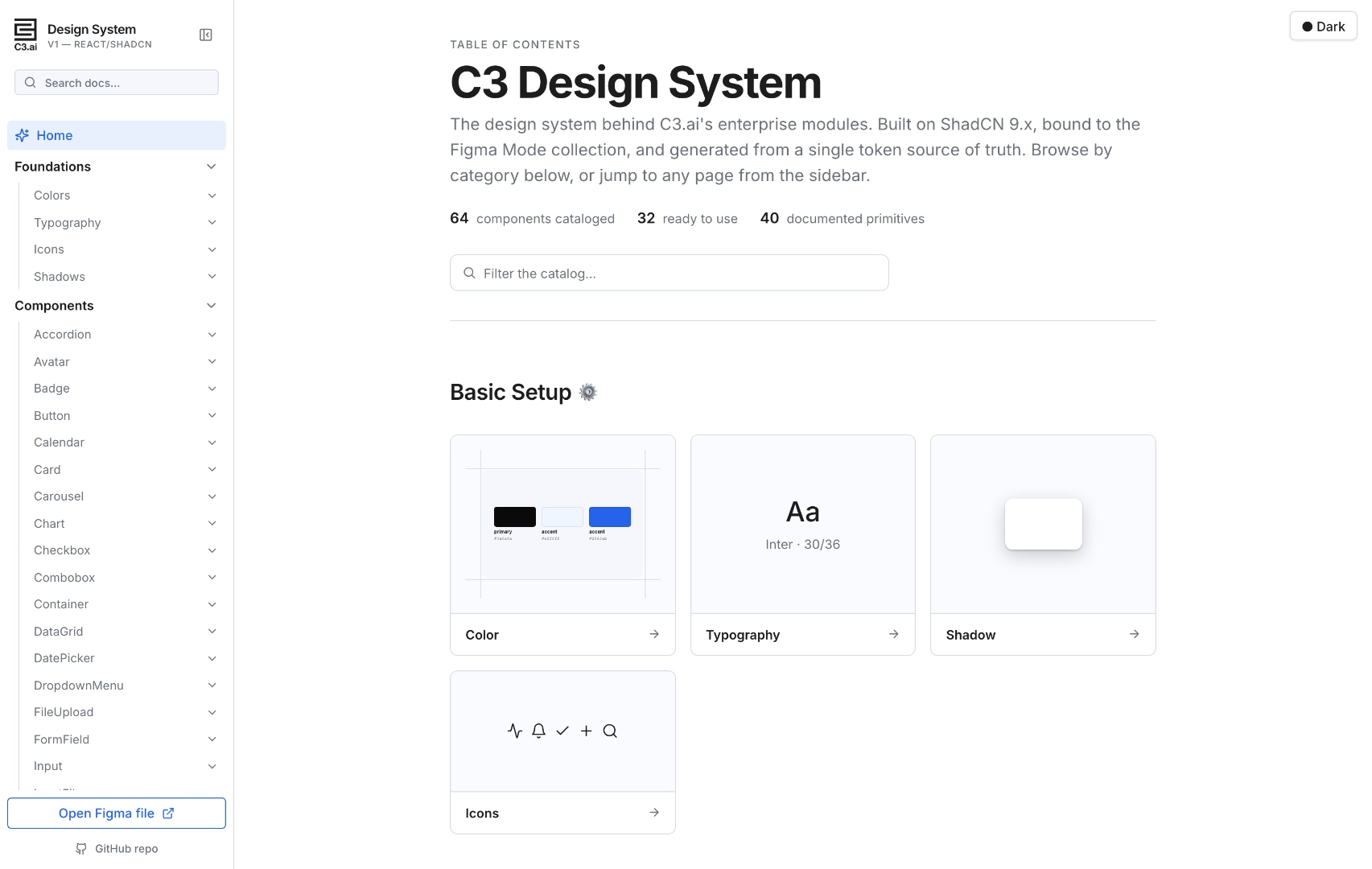
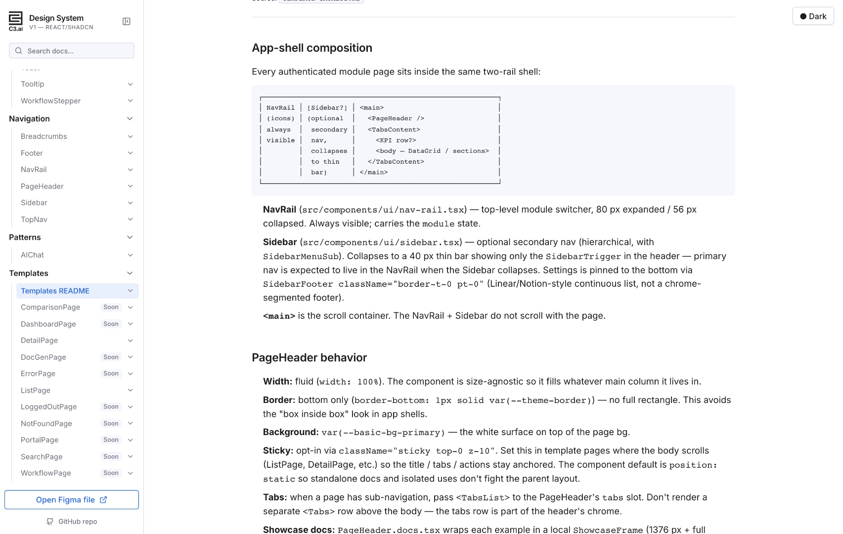
We rebuilt the C3.ai design system from the ground up so AI features feel native, not bolted on. One token source, one component library, every pattern designed for AI signal — alerts, search, suggestions, assistants — at enterprise scale.
Enterprise design systems were optimized for forms, tables, and reports — humans entering data, humans reading it back. Our customers now lean on AI for every step: detecting anomalies, surfacing insights, drafting documents, answering questions. The interface needs to communicate signal vs. noise, confidence, provenance, and next best action — natively, at every layer of the stack.
Every color, spacing value, radius, and shadow lives in Figma's Mode collection and flows downstream through a single generator. Designers and engineers ship against the same atoms. Dark mode, accessibility, and density tweaks happen once, propagate everywhere.
Figma
Mode collection
tokens.json
extracted spec
tokens.css
--theme-* vars
Tailwind preset
semantic classes
React + Radix
40 primitives
The Alerts page in C3 Reliability — rebuilt entirely from our new primitives. NavRail for module switching, PageHeader for context, MetricCards with sparkline trends for at-a-glance state, a DataGrid with column-level filters and faceted chips for fast triage. Every AI signal has a path to action in three clicks or fewer.
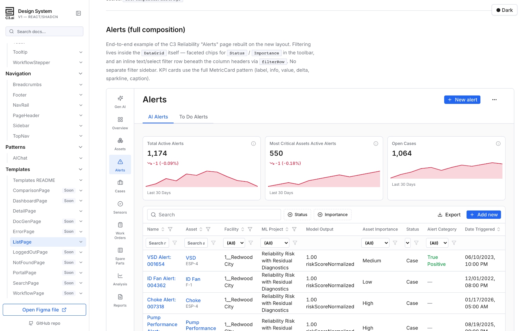
A dedicated "Gen AI" item leads the NavRail with a Sparkles icon — AI capabilities aren't buried in a settings menu.
1,174 AI-detected alerts are surfaced as a delta + sparkline trend. The user sees direction and magnitude before reading a single row.
Faceted chips for Status and Importance live in the toolbar; per-column filters live in the header row. No separate filter sidebar to context-switch through.
An Alert Category column captures True Positive vs. False Positive — the labels feed back into the model, closing the loop between user judgement and AI training.
Not retrofitted. Designed in from the first commit, validated against real C3 products.
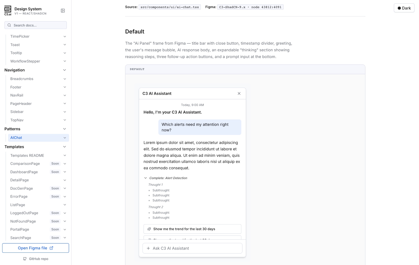
Right-docked assistant pattern. Title bar, suggestion pills, message bubbles, expandable "thinking" steps, follow-up actions, prompt input.
Header, value, tone-aware delta, optional sparkline, caption. KPI tiles that read at a glance and trend at a longer look.
Tone variants for success/warning/danger plus muted/info for neutral state. Outline + soft + solid appearances for different emphasis levels.
Toolbar chips, inline header-row filters, global search, active-filter pills. Built for triaging hundreds of AI-flagged items quickly.
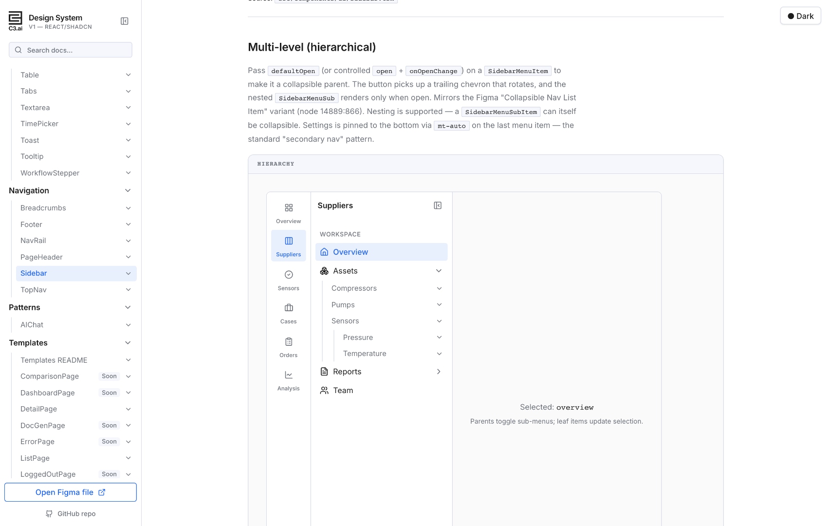
Two-rail app shell — NavRail for module switching, Sidebar for in-module hierarchy. Multi-level nesting, collapsible groups, sticky footer for Settings. The kind of navigation you need when your product has thousands of assets and tens of thousands of work orders.
Every cross-template decision lives in one .md — app-shell layout, sticky PageHeader, MetricCard KPI pattern, DataGrid filter placement, surface tokens. Paired with .cursor/skills/*/SKILL.md files, designers, engineers, and AI coding agents ship from a single playbook.
New engineers ship their first page following one doc, not by spelunking through a year of merged PRs.
Mirrored in TEMPLATE-CATALOG.md (for GitHub readers) and rendered in-app at #/templates/readme. Designers + engineers see the same thing.
"Should this PageHeader be sticky?" "Where does the filter panel go?" Already decided. Teams stop re-litigating per project.
New templates layer on top of the README; new components extend the existing vocabulary. The system gets smaller to learn as it grows.
 Jason Bedient